When you receive an unexpected call from the president of Nintendo of America, you don't question it—you simply answer. This was the advice given to designer Chris Maple by a fellow designer friend in 1998, warning him of an impending call. At the time, Maple was accustomed to such sudden communications from company executives, running his own design business, Media Design, which specialized in urgent, last-minute projects for companies in Seattle. Despite rarely receiving public credit, Media Design had built a strong reputation with clients like Boeing, the Seattle Mariners, and Holland America Line cruises.
Maple had been in the business for years when he received a call from Minoru Arakawa's secretary, inviting him to Nintendo's Redmond office. He was told they wanted him to work on a new game, but details were scarce. Intrigued, Maple accepted, unaware that he was about to contribute to a global cultural phenomenon: Pokémon.
Go West, Pocket Monsters
Upon arriving at Nintendo's headquarters, Maple spent half an hour in the lobby, captivated by a striking 21-inch crystal horse head. "You get a sensation," he recalls. "Like I'd have to read a room when I go into these corporate arenas, since I'm the subjective person presenting the aspect of imagery and content behind whatever's bothering them that day or what's broken or what needs to be fixed. You just learn to pick up stuff."
Eventually, Maple was escorted to a meeting room where he met Arakawa, who had a magnetic personality. Arakawa explained that Nintendo was launching a game in the U.S. and Europe, previously known as Pocket Monsters Red and Green in Japan. They needed a new logo for the rebrand to "Pokémon" for the Western release of Pokémon Red and Blue, and later, the Yellow Pikachu Edition. Maple was given a month to complete the task, with no specific instructions other than the tight deadline.
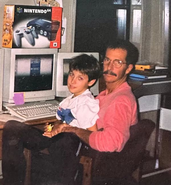 A photo of Maple and his son in Maple's home office. Photo provided by Chris Maple.
Arakawa introduced Maple to the project by presenting a box of toys, papers, and drawings. "It's a Pocket Monster," Arakawa explained. "We're going to call it Pokémon." Maple was tasked with creating a new logo that would work on the pixelated GameBoy screen in both color and black and white.
The Mystery of the Missing Crystal Horse Head
In my recent scavenger hunt online, I sought to uncover more about the crystal horse head Maple mentioned, which he felt subconsciously influenced his design work. However, the horse head seems to have vanished from the internet, not appearing in any videos or photos of Nintendo's old lobby from that time. Nintendo did not respond to my inquiries, and other sources, including former employees and The Video Game History Foundation, had no recollection of the horse head.
Update 7:21 a.m. PT: Shortly after this piece was published, I received a tip about a reference to the horse head in David Sheff's book, "Game Over." On page 198, it mentions, "In the lobby of NOA’s headquarters is a smoky glass coffee table and a crystal horse’s head in a glass case." I've contacted Sheff for more details or potential photos.
If you have any information or photos of this mysterious crystal horse head, please reach out to me at [email protected].
Attaching Energy
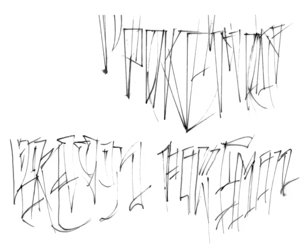
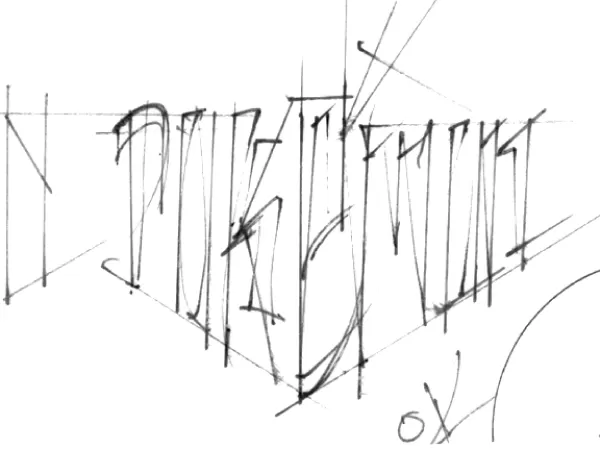
Typically, a logo design would take six months, but Nintendo's deadline was just one month, driven by the need to unveil the logo at E3 1998. Maple, accustomed to tight deadlines, began sketching numerous variations by hand on a light table. He created several options to present to Nintendo, aiming for a design suitable for the GameBoy's small screen.
Original Pokemon Logo Sketches by Chris Maple
 View 8 Images
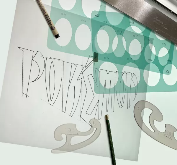
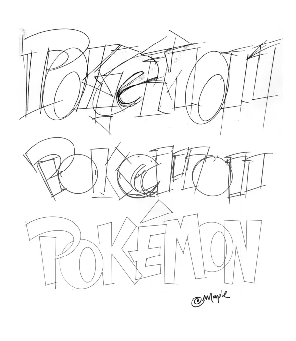
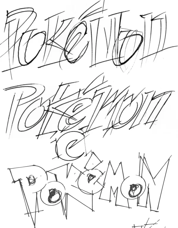
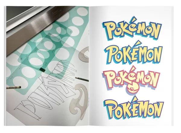 Maple had limited information to work with—just some toys, papers, and a glimpse of the game through early illustrations and a pre-release Nintendo Power magazine. He presented his designs to Nintendo, starting with less favored versions, and then unveiled his top choice.
The room fell silent, and then Don James, former executive VP of operations at Nintendo of America, declared, "I believe this is the one." Arakawa agreed, and Maple was instructed to finalize the logo. When asked why he favored the final design, Maple explained it was about the "energy" and the story behind the brand.
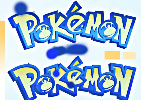 Color tests for the Pokémon logo, provided by Chris Maple.The choice of yellow and blue for the logo might have been influenced by the upcoming game releases, but Maple says it was more about the feeling it evoked. "It just feels a certain way," he noted. "I know it sounds flaky, but it's true."
After finalizing the logo, Maple stepped back as Nintendo handled the marketing and release. Months later, he visited Toys R Us with his son and was stunned by the massive Pokémon display featuring his logo.
Pokémon Forever
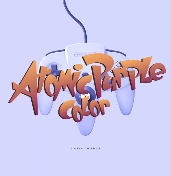
Post-E3, Arakawa asked Maple to make minor adjustments to the logo, which resulted in the version we recognize today. Maple also worked on other Nintendo projects, including Major League Baseball Featuring Ken Griffey Jr., Mischief Makers, and a Star Wars game, as well as redesigning the Nintendo 64 box for the Atomic Purple release.
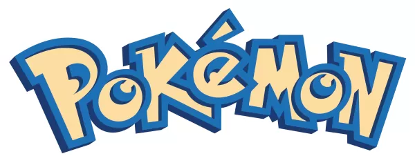 The first final version of the Pokémon logo Maple submitted, prior to the adjustments he made to the P and E.
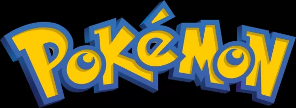 The Pokémon logo with Maple's adjustments, as we know it today.Maple didn't play much of the Pokémon games himself, but his son collected the trading cards until they were banned at school. Maple's daughter proudly shared his achievement with others, saying, "My daddy did that logo."
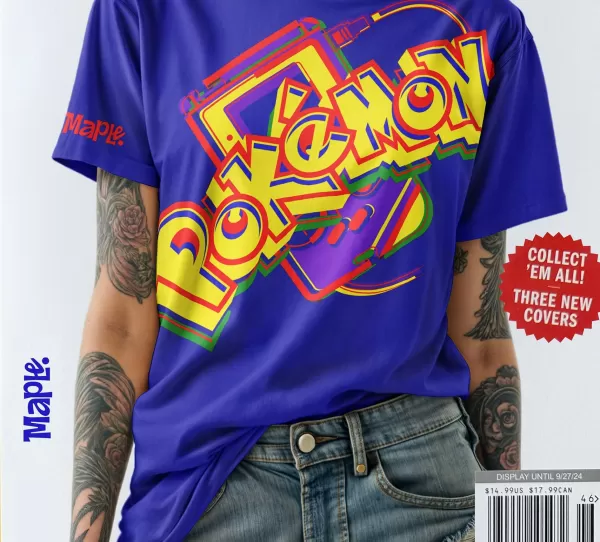
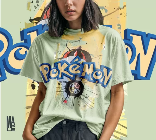
As Nintendo began hiring more in-house designers, Maple's work with the company tapered off. For years, he kept his work on the Pokémon logo private, not listing it on his website or receiving public credit. However, encouraged by his son, Maple has recently started to share his story and showcase his work, including new T-shirt mock-ups.
When asked if he would change anything about the logo now, Maple said he would revert to the original 1998 design and expressed a desire to be involved if Pokémon celebrates its 30th anniversary with a special logo. "I know how things go, but they're going to dig an artist out of the woodwork and he's going to put 30th across that logo somewhere and it's not going to be right," he said, emphasizing the importance of maintaining the logo's foundational energy.
Chris Maple Modern Mock-up Logo Images
 View 4 Images
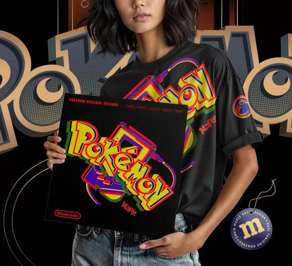
 Reflecting on his contribution to Pokémon's success, Maple feels a sense of responsibility and pride. "I feel really... I feel good about, that I did the thing responsibly for them," he said. He continues to teach children in challenged areas and shares his Pokémon connection with them, drawing characters and displaying the logo to their delight.
Maple's brief but impactful work on the Pokémon logo has left a lasting legacy, replicated across the franchise's vast array of products and media. His story is a testament to the unexpected turns that can lead to enduring contributions to popular culture.